Vitrum
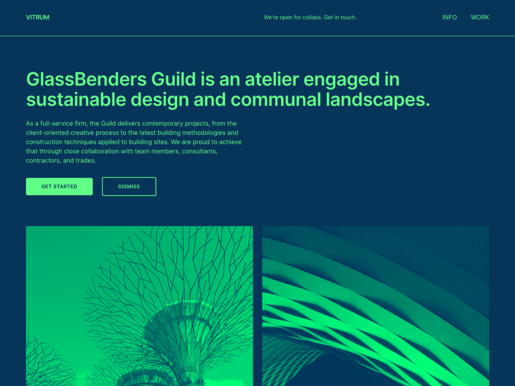
Vitrum made me do a double take with its audacious default palette: vivid #62ff88 neon mint text glowing against a deep #063559 Prussian blue backdrop. Pushing standard content all the way to 1050px within a 1200px wide frame and aligning blocks leftward with generous right breathing room creates crisp asymmetric rhythm. Clean Inter typography keeps short captions and project briefs sharp.
In the Site Editor, I found seven templates including front-page, seven matching patterns, and three vivid alternate style variations: lemoneggplant, pinkorchid, and silverlights. That combination suits bold visual portfolios where photography and concise copy sit side by side across up to four columns. I’d steer adventurous studios and interactive designers straight into Vitrum.
Notes
- Bold Color Contrast: Electric #62ff88 mint on #063559 navy—backed by lemoneggplant, pinkorchid, and silverlights presets—refuses to blend in.
- Asymmetric Geometry: Left-aligned 1050px wide content blocks with deliberate right padding spotlight visual case studies and concise project notes.
- Caveat: With roughly 300 installs and only seven basic patterns, long text-heavy essays can strain eyes under high-chroma defaults.
Verified Specifications
- Developer: Automattic
- Active Installations: 300+
- Reviewed Version: v1.4.2
- Compatibility: WordPress 6.0+, PHP 7.0+
- Architecture: Block Theme (FSE)
- Key Capabilities: Left-aligned 1050px canvas, 3 vibrant style variations, Inter typography, Front-page FSE template, RTL support
Verdict: Whenever a studio portfolio wants electric color and wide left-aligned geometry, I think Vitrum hits a bold nerve. — Official WordPress.org Directory Entry
Discussion
0 Comments