Surrealist
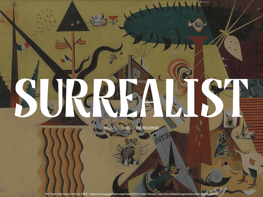
What immediately caught my attention in Surrealist is the unmistakable character of Kame and Kame Poster paired with grounded PT Sans body copy. Set against pure #ffffff white, deep #242121 charcoal, and muted grays (#6e6e6e, #cccccc), the typography delivers genuine exhibition energy. A 710px reading column contrasted with a 90vw wide span lets artwork and essays shift scale dramatically.
Inspecting the Site Editor, I found nine templates—including page-no-title and page-small-title—plus eight distinctive patterns like text-biography and text-name-list tailored for artist rosters and curatorial notes. There are no alternate style variations, keeping the theme tightly aligned with its monochrome gallery vision. I think visual artists, zines, and art historians will enjoy its offbeat poise.
Notes
- Typography & Palette: Kame and Kame Poster display typography paired with PT Sans over stark #ffffff and #242121 ink evokes modernist print catalogs.
- Curatorial Patterns: Eight patterns including text-biography and text-name-list plus nine templates—with no-title options—suit exhibition storytelling.
- Caveat: With roughly 400 active installs and zero alternate style variations, its bold avant-garde lettering won’t fit conventional blogs.
Verified Specifications
- Developer: Automattic
- Active Installations: 400+
- Reviewed Version: v1.0.0
- Compatibility: WordPress 6.0+, PHP 5.7+
- Architecture: Block Theme (FSE)
- Key Capabilities: Full Site Editing, Kame & Kame Poster fonts, 90vw wide blocks, Bio patterns, No-title templates
Verdict: I’d pick Surrealist whenever an art zine or exhibition site needs eccentric display type with clean gallery pacing. — Official WordPress.org Directory Entry
Discussion
0 Comments