Promoter
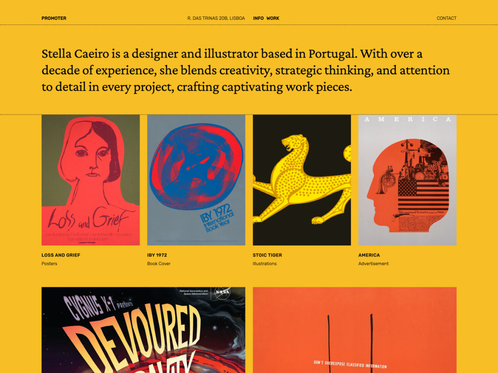
Promoter immediately grabbed my attention with its saturated #f7be26 marigold backdrop and sharp #00000a ink, refusing to whisper like a typical white-box portfolio. Blending Crimson Pro serif elegance with Rubik, Inter Tight, and Norm across a spacious 900px content column and 1200px wide grid makes project summaries effortless to scan. It keeps showcase pages focused strictly on work and credentials.
What makes Promoter flexible in my testing is its five-preset variation lineup—ambrosia, aubergine, heavens, negroni, and pianoforte—letting creators swap out the default gold in seconds. Seven templates and nine patterns, including a ready-made about layout, get solo portfolios live without friction. I’d recommend it to illustrators, architects, and designers seeking punchy simplicity.
Notes
- Style Variations: Five playful presets—ambrosia, aubergine, heavens, negroni, and pianoforte—deliver instant palette contrast beyond the bold #f7be26 default.
- Typography & Palette: Mixing Crimson Pro with Rubik, Inter Tight, and Norm gives wide 900px portfolio blocks genuine editorial authority.
- Caveat: With roughly 400 active installs and nine minimal patterns, detailed multi-page agency case studies will need extra custom sections.
Verified Specifications
- Developer: Automattic
- Active Installations: 400+
- Reviewed Version: v1.0.2
- Compatibility: WordPress 6.0+, PHP 5.7+
- Architecture: Block Theme (FSE)
- Key Capabilities: 5 style variations, Crimson Pro & Rubik fonts, 9 portfolio patterns, 900px/1200px wide layout, RTL support
Verdict: I think Promoter hits a sweet spot for creatives who want punchy color and lean portfolio blocks without bloat. — Official WordPress.org Directory Entry
Discussion
0 Comments