Pierian
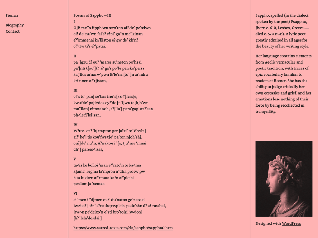
Pierian breaks traditional web design rules on purpose, giving headings, body text, links, and navigation equal weight across three distinct columns for menus, posts, and a profile block. Watching that quiet hierarchy pop on a blush-pink canvas (#ffb3b3) with #111111 ink struck me immediately, blending Crimson Pro, Inter, and JetBrains Mono across an 800px to 1200px grid.
When I browsed its Global Styles, I liked having dogwood, marula, and plums variations alongside seven templates and four patterns (including sidebar and sidebar-right). Built with left and right sidebars plus post formats, it fits literary notebooks and personal index sites where navigation stays constantly visible.
Notes
- Editorial Philosophy: Equalized typography across headings and body pairs with three columns separating navigation, posts, and profile details.
- Style & Font Trio: Crimson Pro, Inter, and JetBrains Mono harmonize cleanly across the blush default and dogwood, marula, and plums presets.
- Caveat: Flat heading hierarchy reduces visual scannability on long posts, and only four patterns ship with its 100-install footprint.
Verified Specifications
- Developer: Automattic
- Active Installations: 100+
- Reviewed Version: v1.0.1
- Architecture: Block Theme (FSE)
- Key Capabilities: Full Site Editing, 3-column layout, Crimson Pro & JetBrains Mono, 3 style variations, Left & right sidebars
Verdict: I appreciate Pierian’s bold anti-hierarchy experiment for literary notebooks, though readers used to big headers may need adjustment. — Official WordPress.org Directory Entry
Discussion
0 Comments