Otis
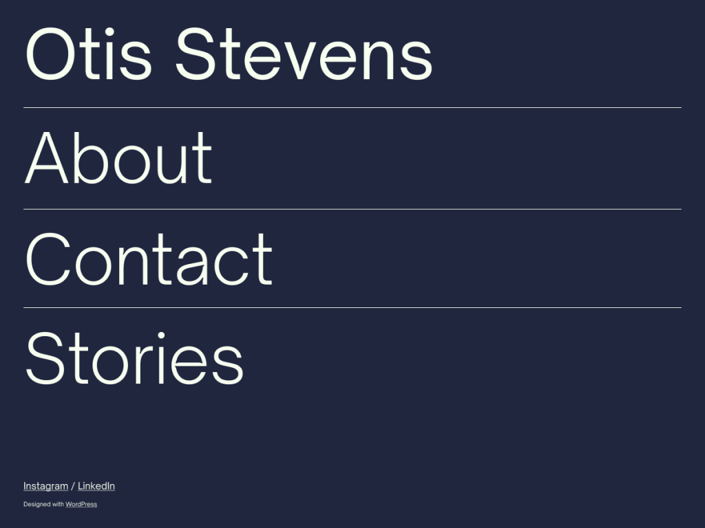
Otis makes an unapologetic nocturnal first impression on me: deep midnight navy (#20263e) paired with pale mint-white (#f7fff0) and #9395b1 muted slate. By anchoring its header with oversized Open Sauce Sans typography inside an 820px column (1000px wide), the theme proves a personal blog needs zero photography to command attention.
Its architectural footprint couldn’t be leaner, delivering four core templates (home, index, page, single) and three utility patterns (404, footer, posts) with no style variations. When I want opinionated typography that forces me to keep layouts uncluttered and text-focused, Otis enforces healthy discipline.
Notes
- Nocturnal Contrast: Midnight #20263e grounds and mint-white #f7fff0 Open Sauce Sans type create a calm, image-free dark reading environment.
- Opinionated Scope: Large header typography and streamlined home, index, page, and single templates keep focus squarely on written prose.
- Caveat: Zero style variations, only three patterns, and no dedicated archive, search, or 404 HTML templates limit complex site structures.
Verified Specifications
- Developer: Automattic
- Active Installations: 100+
- Reviewed Version: v1.0.4
- Compatibility: WordPress 5.8+, PHP 5.7+
- Architecture: Block Theme (FSE)
- Key Capabilities: Full Site Editing, Open Sauce Sans, Dark midnight palette, 4 core templates, Image-free layout, RTL support
Verdict: I’d install Otis for a stark, dark-mode essay site where oversized type replaces featured photos completely. — Official WordPress.org Directory Entry
Discussion
0 Comments