Observer
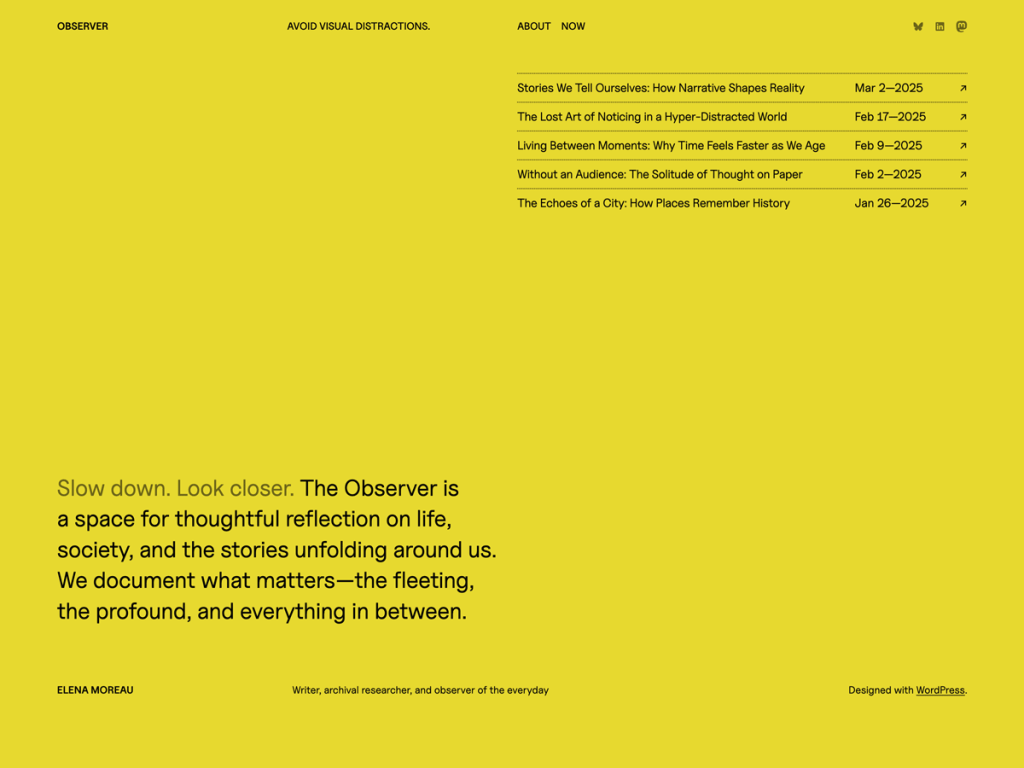
The first thing that struck me in Observer is its unapologetic acid-yellow canvas (#e8d930) set against deep ink (#030202). Built explicitly for writers who don’t depend on photography, it relies on Pitagon Serif, Pitagon Sans Text, Inter, Hauora, and Uncut Sans to carry every page through proportion alone. A 670px text measure inside a 1280px wide grid keeps essays focused and crisp.
If the default yellow feels too electric, I like that Automattic bundled five style variations—bacchanalia, ivorial, monotonal, saharian, and tnmt—to dial the mood from stark black-and-white to warm paper. Its seven templates and eight patterns strip away decorative bloat in favor of clean archives and single posts. I’d put dedicated columnists and independent newsletter writers straight into this workflow.
Notes
- Editorial Feel: Typographic hierarchy across Pitagon Serif, Inter, and Hauora drives the entire layout without leaning on hero photography.
- Style Variations: Five built-in presets—bacchanalia, ivorial, monotonal, saharian, and tnmt—let writers soften or sharpen the bold default palette.
- Caveat: With around 500 installs and zero ratings, the image-sparse setup and bold default yellow won’t suit visual portfolios.
Verified Specifications
- Developer: Automattic
- Active Installations: 500+
- Reviewed Version: v1.0.1
- Compatibility: WordPress 6.7+, PHP 7.2+
- Architecture: Block Theme (FSE)
- Key Capabilities: Full Site Editing, 5 style variations, Pitagon & Inter type system, 8 block patterns, RTL support
Verdict: I love Observer’s conviction that sharp prose and five strong typefaces need zero photography to hold a page. — Official WordPress.org Directory Entry
Discussion
0 Comments