Dadaist
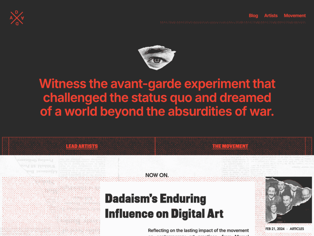
Mixing Antique Série, GravePresse, Futura Renner, Besley, and Overused Grotesk on a single site would overwhelm most layouts, yet I’m impressed by how Dadaist turns that typographic collision into authentic collage art. Against clean #fbfbfb white and #111111 black, its #f04031 vermilion highlights punctuate headlines with gallery-poster punch.
In the Site Editor, I can swing quickly between three thematic variations—eroded-styles, expanded-type, and geometric-headliner—across 7 templates, 10 patterns, and an 800px/1200px grid supporting two- or three-column feeds. Cultural commentators, artists, and zine collectives will thrive here, while conventional brands should look elsewhere.
Notes
- Typographic Energy: Combines eight fonts including Antique Série, GravePresse, and Futura Renner with #f04031 vermilion accents.
- Style Presets: Includes eroded-styles, expanded-type, and geometric-headliner variations plus 10 block patterns.
- Caveat: Its deliberately discordant collage aesthetic and 200-install footprint won’t suit mainstream corporate or neutral blogs.
Verified Specifications
- Developer: Automattic
- Active Installations: 200+
- Reviewed Version: v1.0.3
- Compatibility: WordPress 6.7+, PHP 7.2+
- Architecture: Block Theme (FSE)
- Key Capabilities: Full Site Editing, 8 bundled fonts, 3 style variations, 10 block patterns, 2-or-3 column layouts
Verdict: I’d choose Dadaist when a creative blog deliberately wants restless avant-garde typography instead of polite conformity. — Official WordPress.org Directory Entry
Discussion
0 Comments