Bibliophile
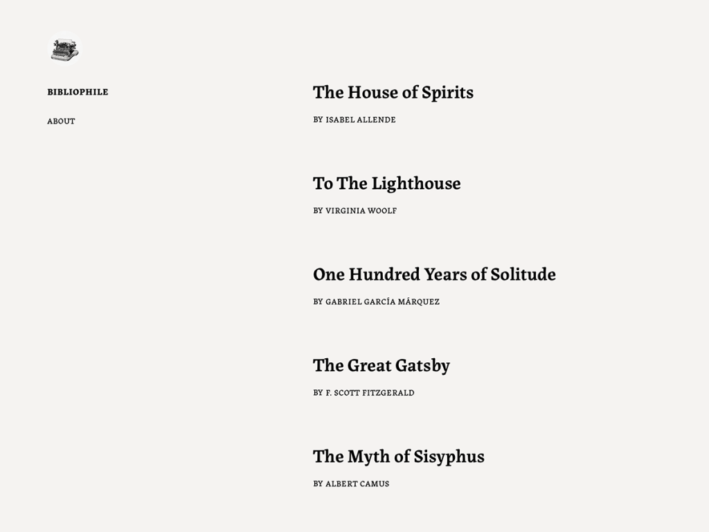
Reading through Bibliophile feels to me remarkably like settling into a well-typeset paperback. Moving the site header into a quiet left sidebar frees the right-hand 620px column to focus purely on prose over warm #f5f3f1 paper and #edebe9 stone highlights. Albura, Albura Light, and Albura Semibold—backed by System Font—give essays gentle, literary poise.
In my inspection, Bibliophile keeps its Site Editor footprint intentionally minimal: six templates including a custom page-about view, just two patterns (footer and hidden-no-results-content), and no style variations. That lean footprint puts long-form comfort ahead of page-builder novelty while retaining full RTL support. I recommend it to book bloggers, academics, and literary essayists.
Notes
- Reading Rhythm: Warm #f5f3f1 off-white paper, a tight 620px line length, and Albura weights emulate comfortable print book typography.
- Layout Geometry: Placing site navigation cleanly in a left sidebar leaves the main reading column completely clear across six FSE templates.
- Caveat: At around 400 installs with only 2 patterns and zero style variations, visual customization depends entirely on manual block edits.
Verified Specifications
- Developer: Automattic
- Active Installations: 400+
- Reviewed Version: v1.0.4
- Compatibility: WordPress 6.1+, PHP 5.7+
- Architecture: Block Theme (FSE)
- Key Capabilities: Left-sidebar FSE navigation, Albura font family, 620px book-like measure, Custom About template, RTL support
Verdict: For long-form writers who prize quiet, bookish readability over flashy patterns, I find Bibliophile deeply restful. — Official WordPress.org Directory Entry
Discussion
0 Comments